

Project — 2025
IAA
Your legal community, no frills and nothing traditional — revolutionising legal education in Brazil to make it more practical, dynamic and in tune with the market.
- Client
- Instituto de Advocacia Aplicada
- Year
- 2025
- Category
- Legal education
- Services
- Visual identity
- Icon & app
- Website
- Social media
- Events

The challenge
Create a timeless, tech-forward and accessible brand that felt modern without losing the solidity and credibility the legal field needs to show.
The solution
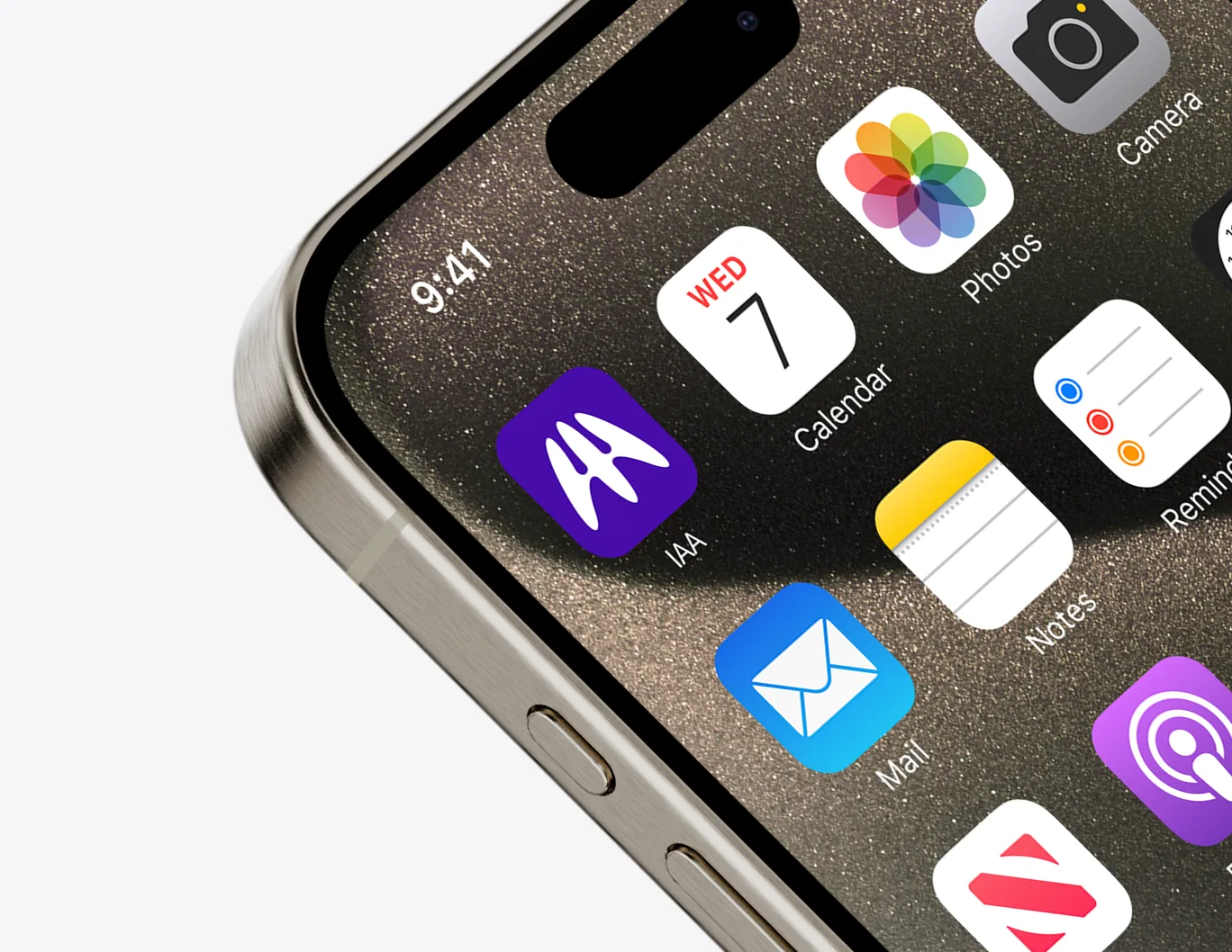
A brand's tone of voice starts at first contact. We drew an elegant, modern icon — solid yet fluid — carrying the idea that law doesn't have to be dull: all it takes is clear communication, backed by efficient, well-explained methods.
01 — Concept
Initials + union + connection
The work had two keywords: “connection” and “union”. An institute exists to shelter, unite and guide scholars, ground research and debate ideas — so the IAA's image couldn't feel frozen in time; it had to embrace the new, the modern, progress.
The symbol joins the letters I, A and A in one continuous stroke. Being made of organic shapes, it is paired with a straight typeface, Plus Jakarta Sans, for balance.
02 — Identity
An icon, solid yet fluid
An A drawn as one continuous line, glowing like neon on deep purple: technology and accessibility, without losing the credibility law demands.

03 — Colour
Purple Blue
The main colour is a bluish purple we nicknamed Purple Blue, chosen to stand apart from the reds and blues common in the legal market.
04 — Applications
A community on every screen
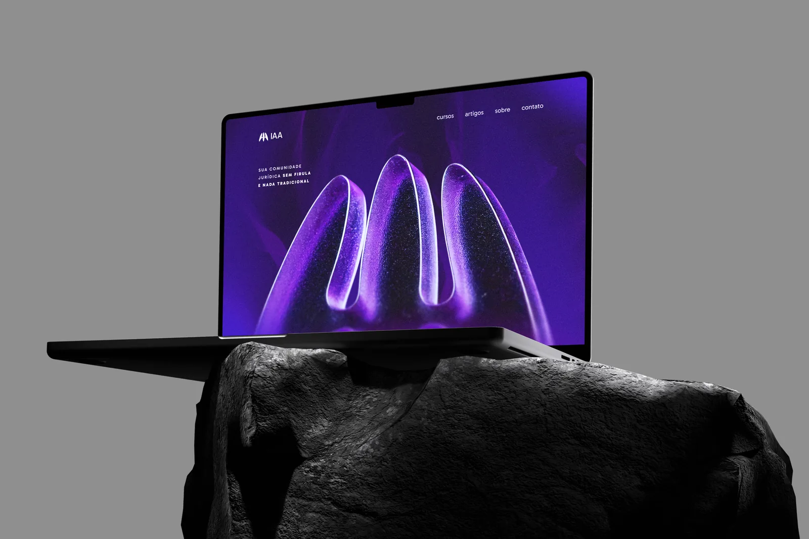
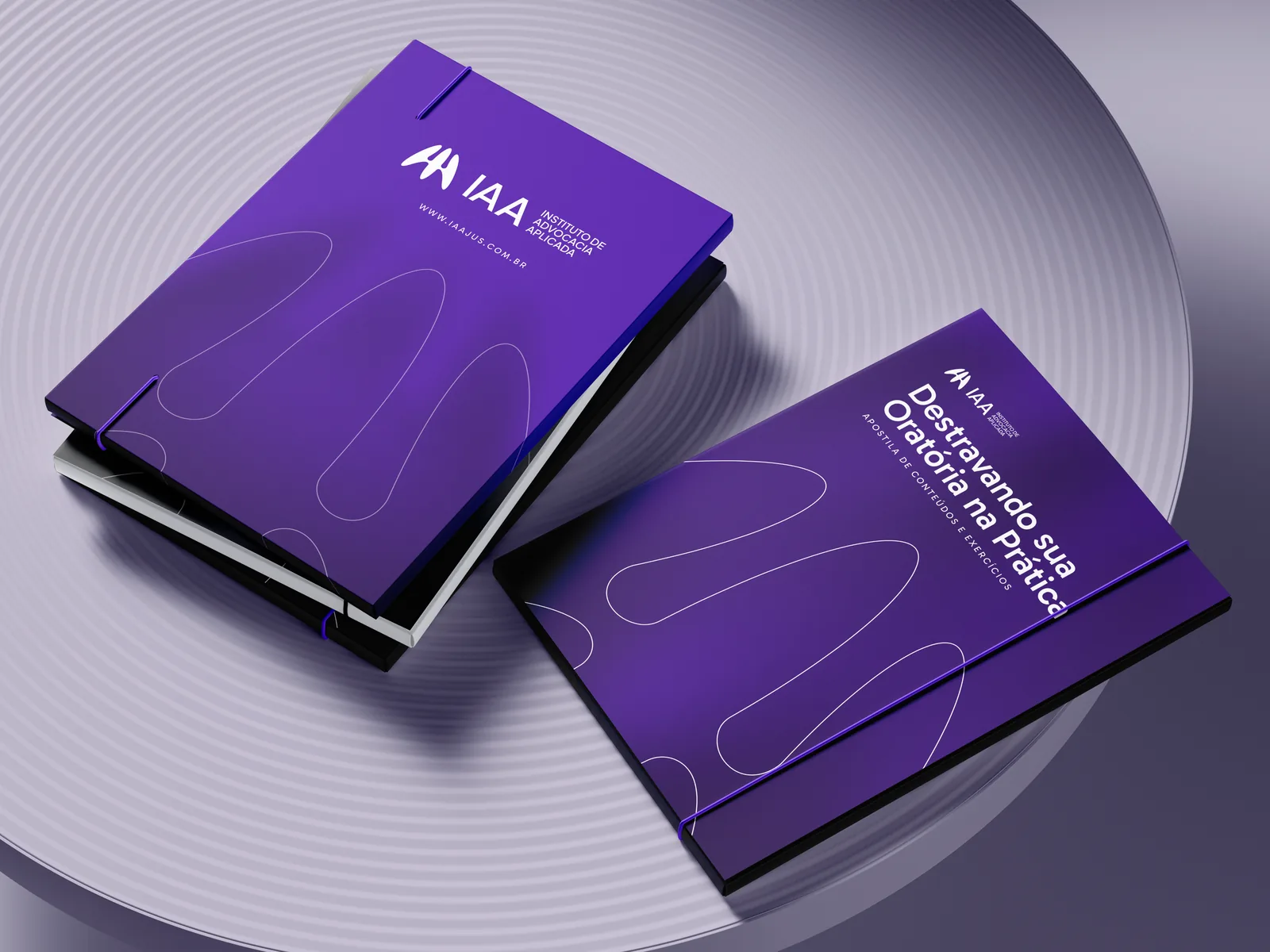
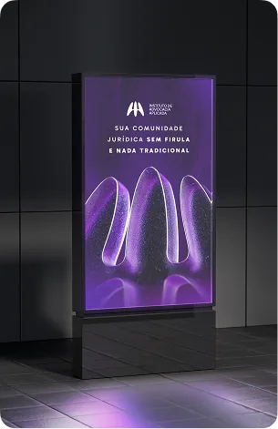
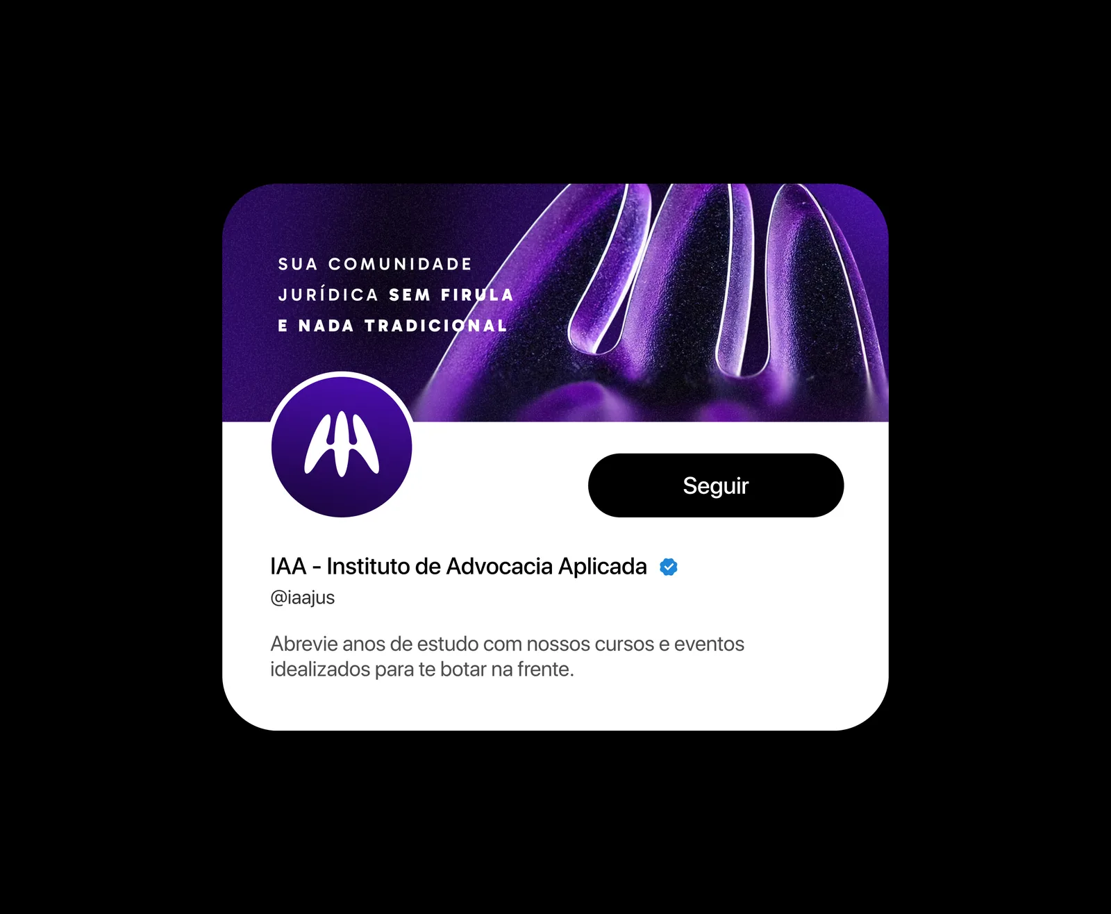
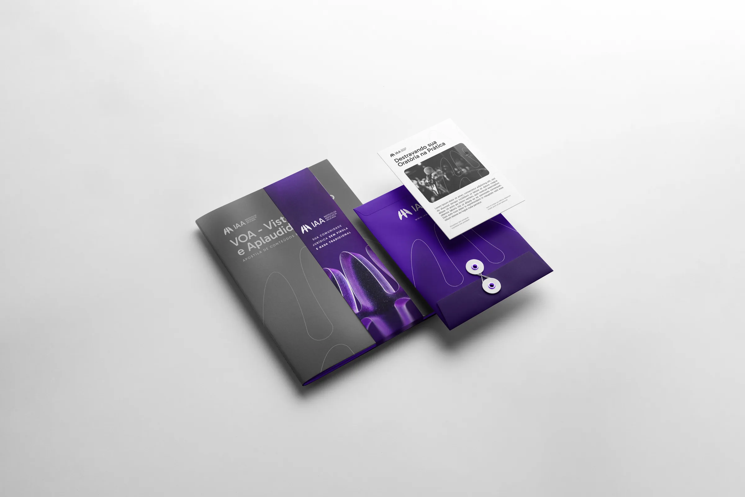
From phone to website, from social media to the magazine and the lit totem: the same direct, no-frills voice in every format.
Law doesn't have to be dull.
Next projectMGZSPORTS