

Project — 2025
DANIEL WINTER
Science, care and performance define this brand. Focused on sports nutrology, it expresses a medical practice that values the individual and connects health, movement and quality of life.
- Client
- Dr. Daniel Winter
- Year
- 2025
- Category
- Health · Sports nutrology
- Services
- Visual identity
- Stationery
- Apparel
- Social media
The challenge
Renew the brand of a doctor who was already recognised, without losing what people knew it by, and express a medicine that joins technical knowledge with human attention — where performance only makes sense when health comes first.
The solution
An identity that joins precision and closeness. We kept the previous brand's two joined initials, but swapped their rigid construction for the flow of a hand gesture, almost a signature: the same origin, told in a more human, organic way.
01 — Concept
The initials, by hand
Every choice reinforces one commitment: caring for people and their goals. From language to visual expression, the whole conveys trust and clarity.
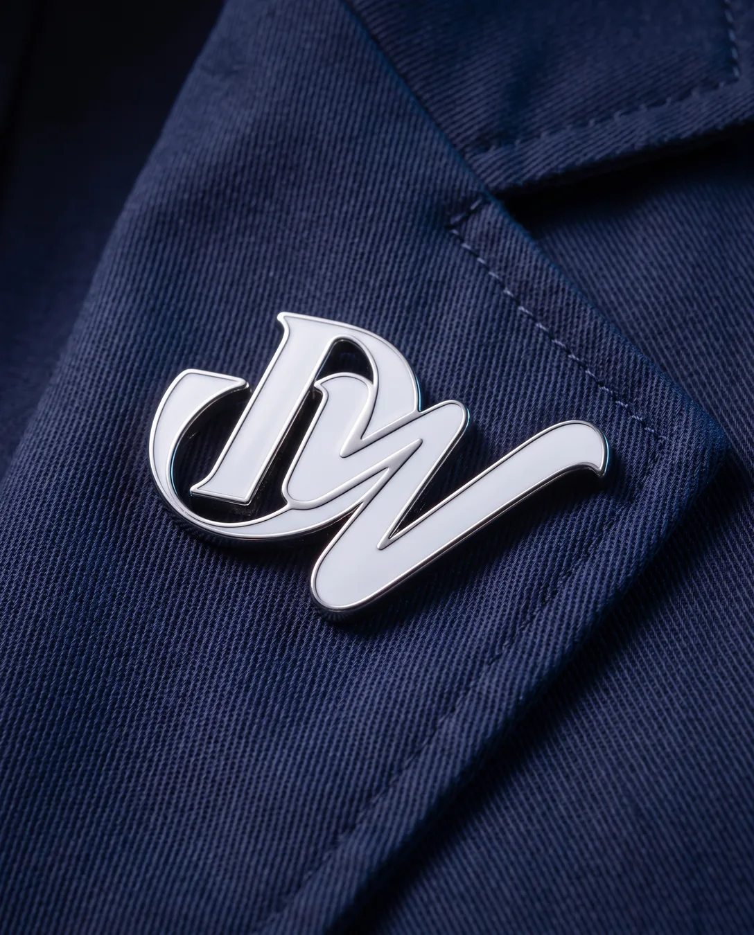
The D and the W meet with the flow of a signature, in tune with the calligraphic line that guides the whole new identity. The full wordmark serves websites, email signatures and documents; the symbol, icons, social media and merchandise.
02 — Identity
A calligraphic stroke
On dark grounds the brand goes in white or off-white; on light ones, in deep blue or graphite — contrast and legibility that keep the stroke's detail in any application.



03 — Colour
A blue that carries trust
Deep blue and white form the base: the blue brings seriousness and trust, the white clarity and room to breathe. Two more blues widen the family, a warm off-white softens the layouts and graphite supports text and contrast.
04 — Applications
From the clinic to social media
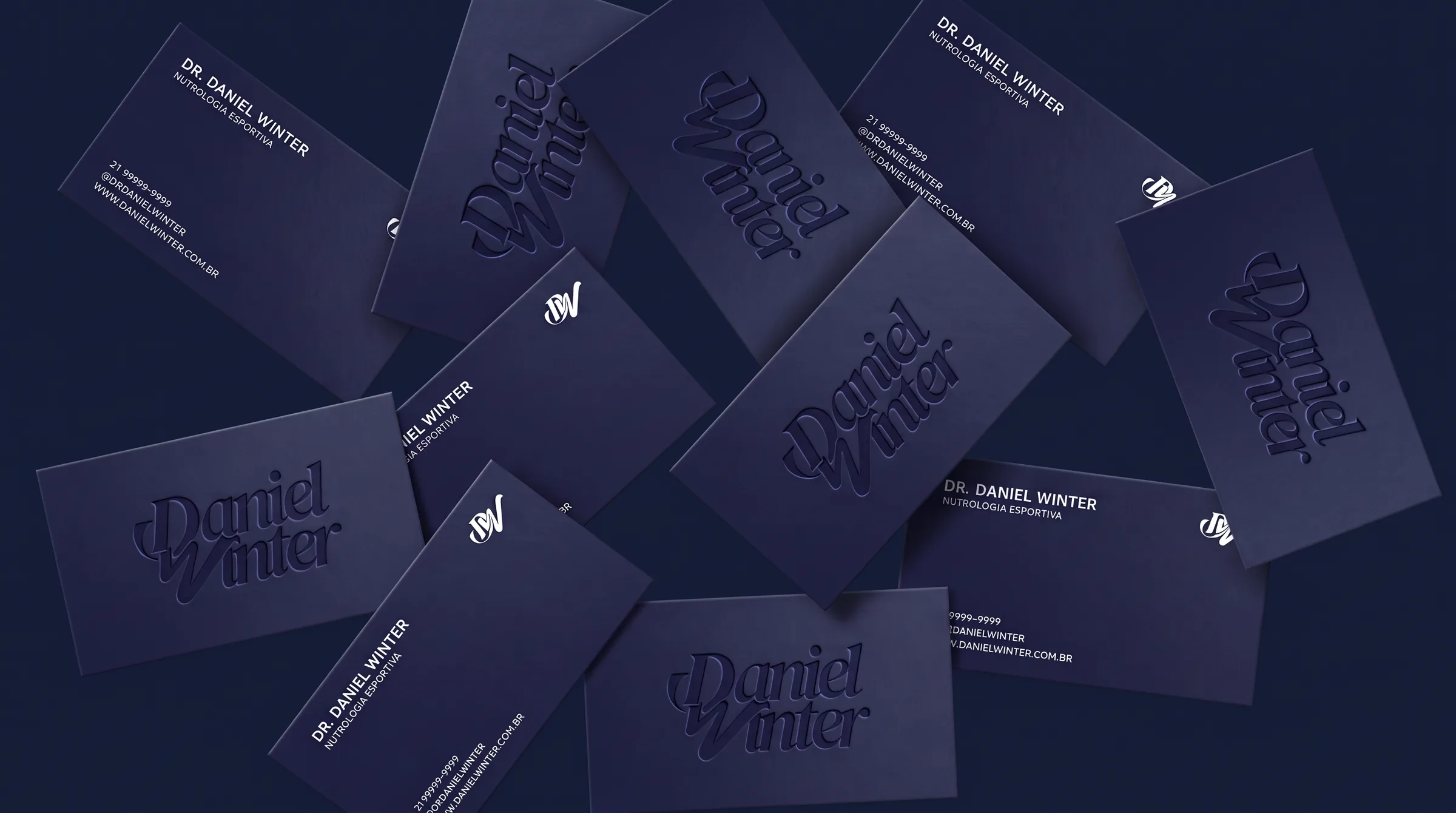
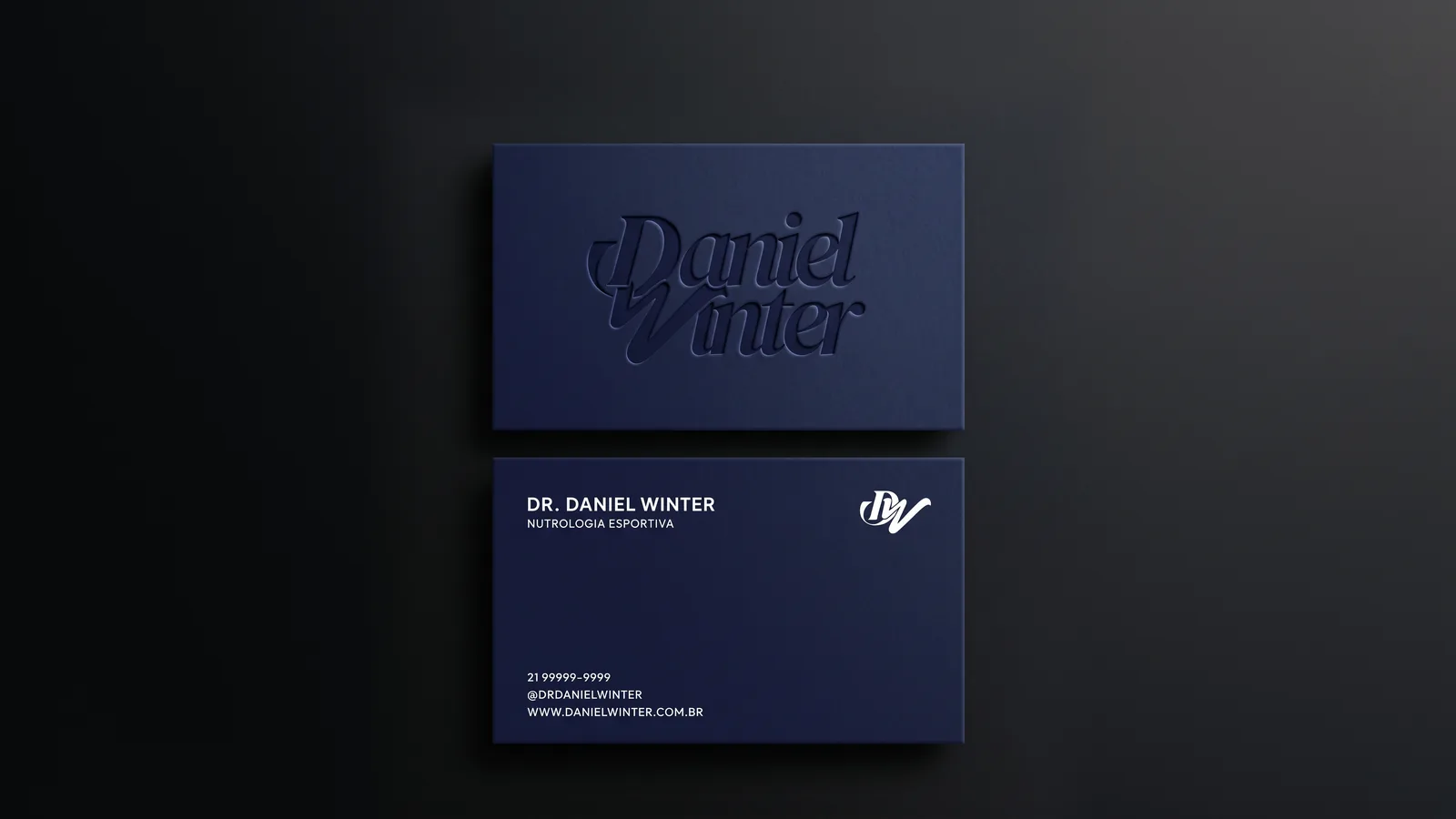
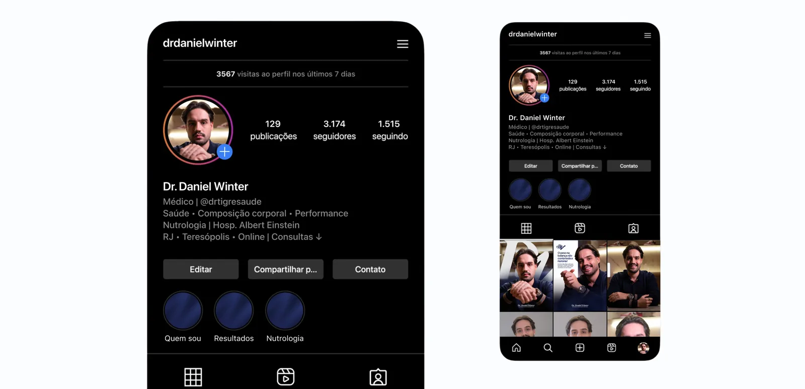
Cards, coats and pins, and a social media presence that puts the doctor up front, always with the brand's stroke close by.





Health comes first.
Next projectORIGIN TURTLE